Sea Ice II: Reading Graphs
My previous post contained a graph of northern hemisphere sea ice from which it seemed clear that the past trend of declining area, rather than continuing as the JPL claimed, had reversed. The first comment on that post claimed that I had cherry picked my data, offering as evidence another graph presenting the information in a different form which, the commenter said, supported the JPL claim.
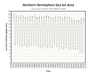
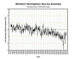
As I pointed out in my response, his graph did not support the claim either, although it did not contradict it as strikingly as mine did. That raises the question of why two graphs from the same web page presenting the same information looked so different. While it might be possible to answer it by searching out additional information on the web site, I thought it would be more interesting to see what one can figure out simply by looking at the graphs. I will refer to his graph as graph A and mine as graph B. Both are shown below.

--------------------------------------------------

Graph A shows swings within each year over a range of about ten million square kilometers, presumably reflecting expansion and contraction of the area of sea ice with the seasons. The variation in Graph B within each year is much smaller and less regular. Pretty obviously that means that the data in Graph B is seasonally adjusted. The figure for, say, January of 2009 shows how much higher or lower the area of sea ice was than the average for Januaries over the reference period, eliminating the seasonal variation. That fits the title. The graph is showing, not the area, but the anomaly, the difference between the area at that time and its previous average.
That way of drawing the graph makes it easier to see trends, since changes over the years aren't masked by the much larger changes within each year. A more subtle difference is that, looking at graph A, one loses almost all of the relevant data. The month to month difference is so large that one cannot tell by eye whether sea ice area in January of 2008 was more or less than in 2009. All you can see is that sea ice area in the month when it was largest was about the same in 2008 as in 2009, and sea ice area in the month when it was smallest was a little larger in the second year. You are left trying to interpret trends based only on the extremes of the cycle—data from two observations a year instead of about twelve.
Graph B, by eliminating the seasonal effect, gives a much clearer picture. If sea ice area was larger in ten months of the second year than in the corresponding months of the first year and lower in two, that will show as a rising trend with a couple of downticks—even if the low months happened to also be the extremes. What the commenter viewed as noise on Graph B—the shifts up and down month by month—is information, information obscured by the large seasonal variation on Graph A.
[To see the webbed graphs, which are larger and clearer than the images here, click on the Graph A and Graph B links]
-----------------------------------------------
As a result of a comment to this post, I found a graph showing April sea ice cover from the National Snow and Ice Data Center, the source that the JPL article cites. Here is the graph. It shows ice extent rising for the past two years.

(Later addition)
The data from the same source for May are now in. May sea ice extent has risen for the past three years, bringing it back to about its level in the late 1980's early 1990's.
On the other hand, poking around the same source, I found the graph for March, which provides at least a little support for the JPL comment I have been attacking, which was published in April. It shows March sea ice rising a lot for two years, but falling a little in the most recent year. To describe that as "continues to shrink" strikes me as clearly misleading, but it's an exaggeration to describe it as a flat lie.
