My view, as I have mentioned before, is that climate change is real and probably in large part due to humans but that it will have both positive and negative effects of uncertain size, making both the size and the sign of the net effect uncertain. The view expressed by most climatologists involved in the controversy and by most commenters in the media, on the other hand, is that the net effect will be negative and somewhere between substantial and catastrophic. Why am I willing to reject their expert opinion in favor of my less expert opinion?
I gave a partial answer in an earlier post, where I pointed out that a similar consensus existed fifty or sixty years ago with regard to the effect of population growth, that I questioned it then, and that what happened since was the precise opposite of what the consensus view predicted.
I also pointed to an article on the cost of carbon published in Nature and being considered by the EPA as a basis for future regulation, one of whose implicit assumptions was there would be no progress in medicine or several other relevant technologies for the next three centuries. That analysis that obviously bad is being taken seriously is evidence that the field has reached a point where people are willing to accept bad arguments if only they led to the orthodox conclusion. This post is further evidence for that claim.
Introduction to Modern Climate Change by Andrew Dessler is an elementary climate science textbook, now in its third edition. In Chapter 9, “Impacts of Climate Change,” it has:
Scientists predict that sea level will rise 47 to 73 cm (19 to 29 inches) above 1995–2014 levels by 2100. This may not sound like a significant challenge, but it is much larger than the 18 cm of sea level experienced over the twentieth century, which is already challenging for many who live near sea level. Like temperature, these predictions of sea-level rise might sound small but, also like temperature, they are not. In Florida, for example, a sea-level rise in the middle of the projected range would inundate 9 percent of Florida’s current land area at high tide.6 This includes virtually all of the Florida Keys as well as 70 percent of Miami-Dade County. Almost one-tenth of Florida’s current population, or nearly 2 million people, live in this vulnerable zone, and it includes residential real estate valued at hundreds of billions of dollars. It also includes important infrastructure, such as two nuclear reactors, three prisons, and 68 hospitals.1
That struck me as implausible, given what else I had seen on the effect of sea level rise. The footnote for the claim was to Stanton and Ackerman (2007), which turned out to be not a peer reviewed journal article but a report commissioned by the Environmental Defense fund, an environmentalist group. It includes the same claims, but for 27 inches of Sea-level rise not the 24 inches that is Dessler’s “middle of the projected range.” It refers the reader to Appendix C for “detailed sources and methodology.” Going there, I found:
To estimate the impact of sea-level rise on land area, populations, and public and private assets and infrastructure, we began with a 1:250,000 Digital Elevation Model (DEM) map of the State of Florida, and divided the state into “vulnerable” and “not vulnerable” zones demarcated by 1.5 meters of elevation and other factors described by Titus and Richman (2000) as corresponding to 27 inches of sea-level rise.
So what they are showing as the vulnerable area is not the 27 inch or 24 inch contour but the 1.5 meter (5 feet) contour. The explanation, from Titus, J. G. and C. Richman (2001). “Maps of lands vulnerable to sea level rise: modeled elevations along the US Atlantic and Gulf coasts.” Climate Research 18: 205–228, a journal article written by two EPA people and presumably peer reviewed:
Thus, at a typical site, the 1.5-meter contour would be flooded by spring high tides (i.e., high tides during new and full moons) when sea level rises 80 cm
Figure 1 below (Titus and Richman Figure 4) is a map of Florida with the region within the 1.5 meter contour colored red, the region between 1.5 and 3.5 blue. Dessler’s middle of the projected range is 60 cm. Stanton and Ackerman’s 27 inches is 68.6 cm. The map shows what its authors claim would be flooded at 80cm.
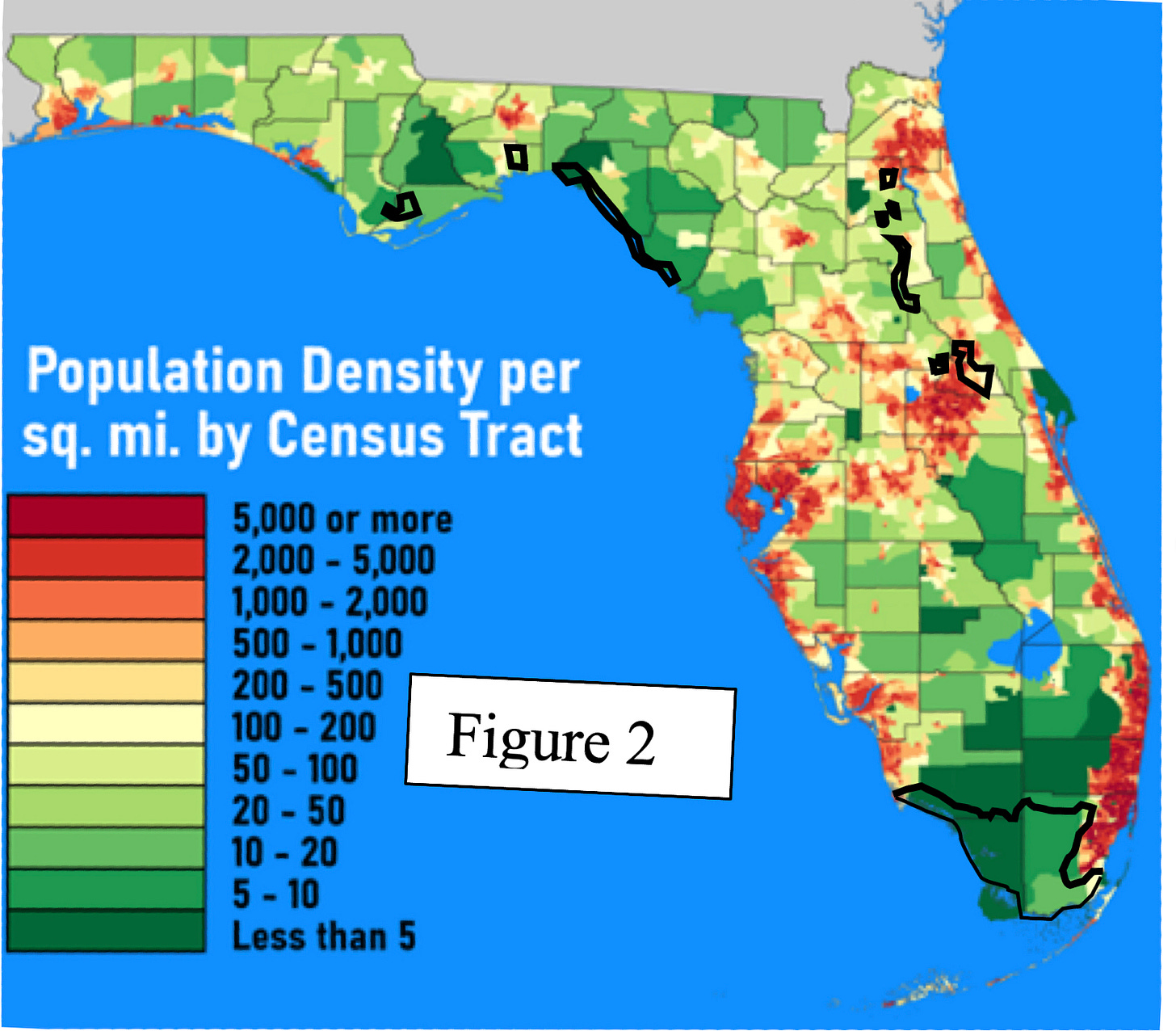
Figure 2 below is a population density map of Florida from Wikipedia to which I have added the 1.5m contours from Figure 1. The large flooded area on the southern tip of Florida includes none of the densely populated area around Miami; only one of the tiny areas farther north appears to be in part on a populated area. That is not surprising — areas very close to sea level are likely to be marsh, in this case the everglades, and poor places to build on.
Stanton and Ackerman claim that their own calculations, using data bases of elevation and population, produce a total population in the at-risk area of 1.5 million. That was the figure Dessler gave in his first edition, presumably increased to almost 2 million in the third edition to reflect the increase in Florida’s population. Figure 2 shows why I don’t believe it. The flooded areas are in places almost all of which have very low population density, making it hard to see how flooding nine percent of the land area, most of it in the everglades, can flood almost ten percent of the population. Even if all of the Florida Keys are flooded, their total population is only about 80,000.
That problem is in addition to the fact that Dessler’s claim is for 60 cm of sea level rise, Stanton and Ackerman’s, from which Dessler got his figure for how many people are flooded, is for 68.6 cm (27 inches), and Titus and Richman get the 1.5 m contour that Stanton and Ackerman say they are using by assuming 80cm of sea level rise. Further reasons for suspicion are that Stanton and Ackerman gave figures for sea level rise substantially higher than either the IPCC figure at the time or the current IPCC figure, which suggests that they were trying to make the consequences of climate change look as scary as possible, and that they write “1.5 meters of elevation and other factors described by Titus and Richman (2000) as corresponding to 27 inches of sea-level rise” when Titus and Richman actually describe 1.5 meters as corresponding to 80 cm (31.5 inches) of sea level rise.
I can see three possible explanations:
1. I have made a mistake in my calculations and Dessler’s claim is true. After discovering the apparent error I emailed Dessler describing it. He replied and we had a couple of rounds of exchanges. He appeared to concede that his 60 cm might be wrong, said he would have someone look into the other part of my criticism.
2. His statement is a noble lie, a deliberate falsehood told to produce good consequences, in this case to persuade students that climate change is a terrible threat. He denied that and, after interacting with him, I think it unlikely.
3. Having found a claim he liked, Dessler never bothered to check whether it was true, although an hour reading his source and its source would have found the first error (60 cm vs 80 cm) and comparing Titus and Richman’s Figure 4 with a population density map of Florida, findable on Wikipedia, would have strongly suggested that their numbers were much too high. I consider that the most likely explanation.
It is also the most interesting because it helps answer the question of how it is possible for an orthodoxy, a scientific claim supported by most professionals in the field, to be wrong. Dessler made his claim about Florida in the first edition of his book more than ten years ago. The book was widely used as a textbook. Either nobody in the field bothered to check the claim or those who discovered it was false never told Dessler or Dessler was told, ignored the information, and continued to make the false claim in later editions. So far as I can tell those are the only alternatives.
The way science is supposed to work is that individual scientists try to make sure what they publish is true, some make mistakes, a few may commit deliberate frauds, but both mistakes and frauds are controlled by the willingness of others in the field to spot errors and correct them. That does not work if the attitude of people in the field is that there is no need to check claims that support a conclusion they agree with.
When I pointed out the problem to Dessler and, in the ensuing exchange, pointed him at my analysis of a different false claim (the much repeated 97% claim by John Cook),2 his response was disinterest. He believed the conclusions being argued for, his and Cook’s, were true; that was what mattered. In later correspondence he insisted that he believed scientists should tell the truth, that when they didn’t it should be pointed out, but that that he had never seen any examples of that being necessary. Given his response to my offering him evidence of one case of error (his) and one of deliberate fraud (Cook’s), that is not surprising.
What conclusion is true is what matters — the problem is how to find out. That is difficult in a field where researchers are not concerned with whether what they or others write is true as long as it leads to the right conclusion. If everyone is doing that, none of them can trust his belief about what conclusion is right since each is relying on the others for much of the evidence on which the conclusion depends.
That is why, in the climate context as in others, I do not find “all the experts agree” a compelling argument.
Another Error: Temperature-related Mortality
One issue in evaluating the effect of global warming is the tradeoff between more deaths from heat and fewer from cold. Dessler writes in Chapter 1:
In fact, heat-related mortality is the leading cause of weather related death in the United States, killing many more people than cold temperatures do.
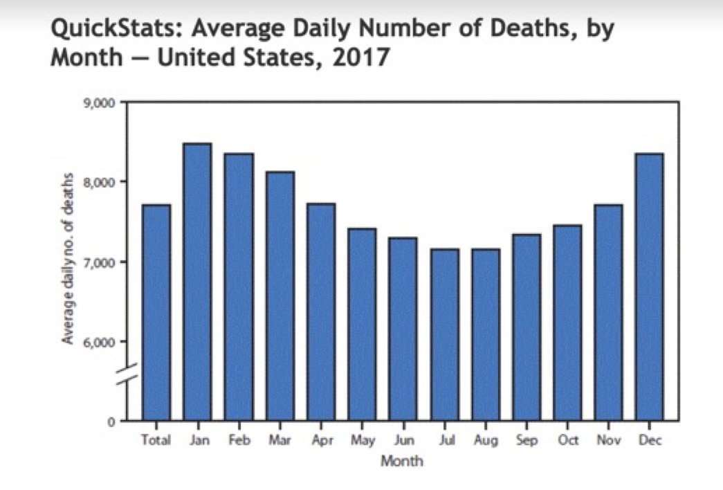
He cites no source for the claim and as best I can tell it is not true. According to a published article by four authors from the CDC, cold kills about twice as many people in the U.S. as heat. That is supported by the pattern of mortality over the year:3
The fact that Dessler could confidently assert a relevant fact that is at least debatable and probably false in a book that has been in print for more than a decade, apparently with nobody ever pointing out the problem, is again evidence that the climate field lacks mechanisms for active error correction, making it possible for false claims to become accepted facts of the field.
Something Else Wrong with Dessler’s Book
Dessler’s dismissal of the issue of reduced deaths from cold is one example, but not the only one, of the most serious thing wrong with the book. In order to evaluate the consequences of climate change one has to look at both positive and negative effects. Chapter 9 of Dessler’s book, which deals with consequences of climate change, does not mention a single positive consequence.
Here is a list of facts a student will not learn from this book:
1. Many more people die from cold than from heat, about fifteen times as many globally according to an old article in Lancet, which suggests that raising global temperatures might be expected to reduce, not increase, total temperature-related deaths.
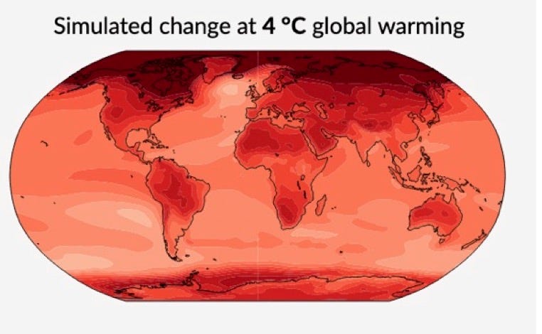
2. Warming due to the greenhouse effect tends to be greater in colder places and colder seasons, the former obvious in IPCC maps of projected temperature change. Temperature increase is usually a good thing when it is cold, a bad thing when it is hot, so the pattern is biased in our favor, which strengthens the conclusion from point 1.
3. CO2 is an input to photosynthesis, so increasing its concentration in the atmosphere increases plant growth and yield. Doubling CO2 concentration, about what the IPCC projects for the end of this century, substantially increases the yield of most crops.4 Increased CO2 concentration also reduces the need of plants for water, since they do not have to pass as much air through the leaves in order to get the carbon they need for growth. That effect is well established experimentally and depends on only the first step, increased CO2 concentration, in the causal chain that leads to climate change.
4. Human land use at present is limited almost entirely by cold, not heat — the equator is populated, the polar regions are not. As global temperatures increase, temperature contours in the arctic shift north, greatly increasing the amount of land warm enough for human use. Land that was previously too cold for human use is now warm enough, even if barely, land further south that was barely warm enough is now warmer. It is not a small effect; in an earlier post I estimated that the net effect of three degrees of additional warming, about what the IPCC projects for the end of the century, is to increase usable land by about the area of the U.S.
What about land lost through making it too warm for habitability? Comparing temperature maps, both average and maximum, to a population density map, there is no obvious pattern — some of the hottest regions are densely populated.
It follows that a student who has learned about climate change from this book will end up with a badly distorted view of its effects. If the book reflects the beliefs of its author, as I think likely from corresponding with him, it follows that an active professional in the field can have a badly distorted view of the effects of climate change, from which it follows that the views of professionals in the field are not a reliable guide to what is true.
My disagreement with the current orthodoxy is not over a simple yes or no fact, such as whether the average global temperature is rising, but over the sum of a large number of uncertain costs and benefits. Setting a value to each of them is a judgement call. If you are confident that the sum is negative it is pretty easy to make high estimates for costs, low estimates for benefits, and perhaps miss a few of the benefits because you are not looking for them.
My conclusion, that the net effect might be positive, is less heretical than most people believe. My earlier post mentioned Rennert et. al. 2022, the Nature article on the cost of carbon which, I argued, badly exaggerated the costs it looked at. Figure 2 of the article shows their calculation of the probability distribution for the cost of carbon. Its left tail is below 0, meaning that their calculations show a (small) probability that putting CO2 in the air might make us better off
.
Essentially the same claim appears in the 2011 paperback (1st?) edition, except that it says 1.5 million instead of nearly 2 million.
The exceptions are C4 crops, of which the important ones are Maise, Sugar cane, millet and sorghum. Increased CO2 reduces their need for water but has little effect on yield when water is adequate.


I don't think anyone has yet disputed the point of the post, which was that the Dessler book is so bad that the fact it is used as an elementary textbook, now in its third edition, implies that the field it is in is in bad shape and its claims about climate change should not be relied on.
Another problem with the cost calculations for sea level rise is 100 years is a very long time in practical terms. Nearly every building in the flooded areas will have been replaced in that period, and since a gradual sea level rise will be obvious the entire time it is happening, entire cities can easily shift to higher ground in a gradual way, or even be lifted up as Chicago once was.